CLIENT
Personal project /
Used in “Brisanet Sustainability Report 2022”
ROLE
Visual Designer
DESIGN TEAM
Bruno M. Filogonio
TIMOPA
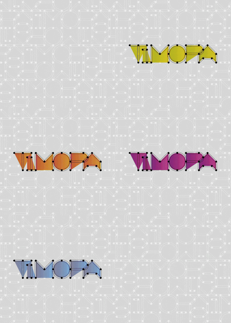
Modular typography for pattern creation, based on a simple, modular grid.
Concept:
Type, choose a color and have fun! Based on the idea of creating backgrounds in a “legolike” style, the type was designed to use the dots on a grid to link the letters of the alphabet in (virtually) infinite combinations.

Structure:
The dots work like a magnet to link the alphabet. The instructions are simple: link the dots of the letters to create a pattern. The type was designed based on a 5×5 grid and it is composed by two parts: structure and fill. They work together to create movement, but also distinguish form perception.
Samples:
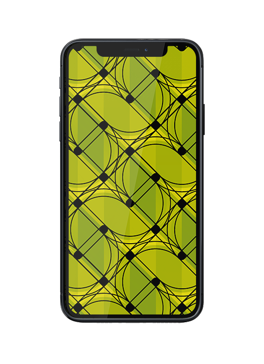
“JF”
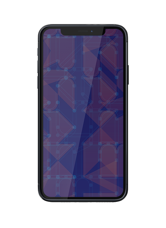
“Brisanet”
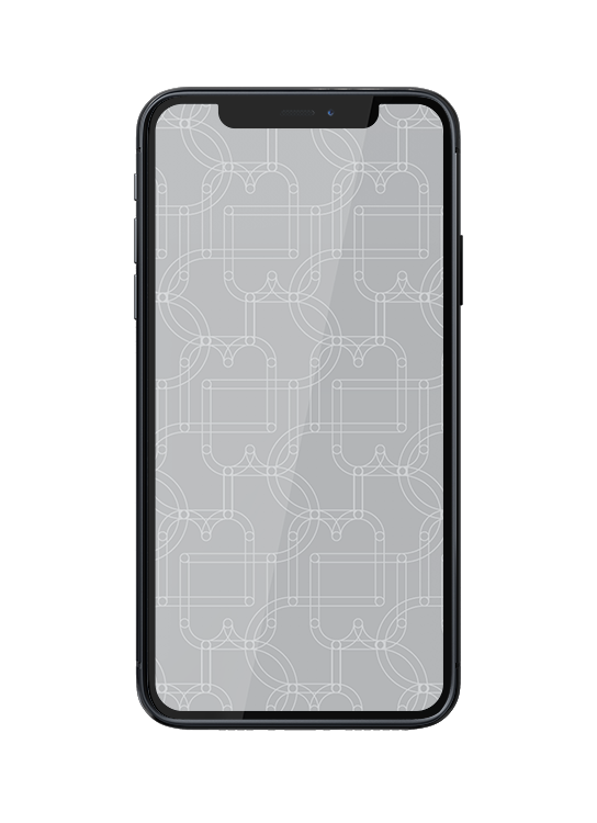
“BJ”
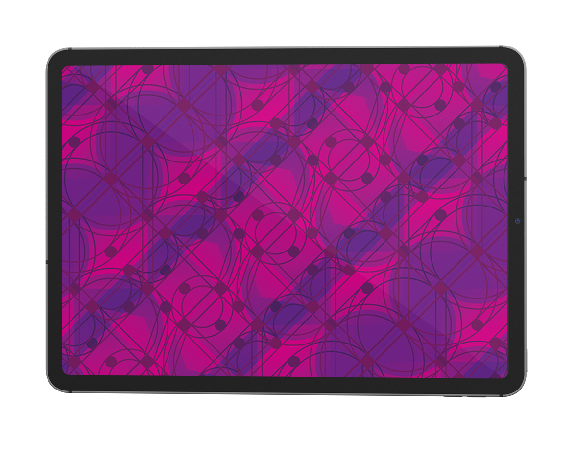
“Bruno”